Chapter 9. Common Widgets and Attributes
This chapter describes many of the widgets that are provided with FLTK and covers how to query and set the standard attributes.
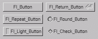
Buttons
FLTK provides many types of buttons:
Fl_Button - A standard push button
Fl_Check_Button - A button with a check box
Fl_Light_Button - A push button with a light
Fl_Repeat_Button - A push button that repeats when held
Fl_Return_Button - A push button that is activated by the Enter key
Fl_Round_Button - A button with a check circle
For all of these buttons you just need to include the corresponding <FL/Fl_xyz_Button.H> header file. The constructor takes the bounding box of the button and optionally a label string:
Fl_Button *button = new Fl_Button(x, y, width, height, "label");
Fl_Light_Button *lbutton = new Fl_Light_Button(x, y, width, height);
Fl_Round_Button *rbutton = new Fl_Round_Button(x, y, width, height, "label");
Each button has an associated type() which allows it to behave as a push button, toggle button, or radio button:
button->type(0);
lbutton->type(FL_TOGGLE_BUTTON);
rbutton->type(FL_RADIO_BUTTON);
For toggle and radio buttons, the value() method returns the current button state (0 = off, 1 = on). The set() and clear() methods can be used on toggle buttons to turn a toggle button on or off, respectively. Radio buttons can be turned on with the setonly() method; this will also turn off other radio buttons in the same group.